Design or Edit a DataGuide Form
When you design a DataGuide Form, you can:
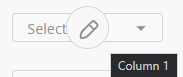
You can also hover over a placed element on the Form Canvas to change the text.
Add an Element
In the DataGuide Form Designer Canvas, you can add questions to the form by clicking on one of the Form Designer Elements or clicking the Add Question box.
Not all the elements are question types. They can be options for a form user to upload a file, capture a signature, enter short, long, or multiple text boxes. You can also define what can be entered in table rows, columns, and table cells.
You can click, hold, and drag an element over to the canvas or you change the element from one type to another by using the dropdown in the element.
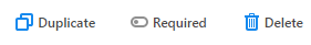
Each element has three buttons at the bottom:
-
Duplicate - Duplicate the element with the same options set in the element
-
Required toggle - An option to make the element a requirement to complete
-
Delete - Remove the element from the form canvas
Add an Map Child Element
You can link and display child object records related to a parent object within a form. Use this when your form needs to capture or update data for multiple related records under a single parent.
| Confirm your version of DataGuide supports Map Child Elements. Older versions of DataGuide had issues where this element couldn’t be used inside Dynamic Panels. There would be a failure to render or return a configuration errors. Later versions have fixed this and added support for the element within Dynamic Panels and improved form actions for child records. |
-
Once the Primary Object for the form has been defined, drag the Map Child Line element from the Elements panel to the form canvas and place it where you want child records to appear.
-
Click on the element and open its Properties.
-
Under Child Object, select the related object (such as Line Items, Tasks).
The element is linked to the correct child records.
-
-
In the Mapping Tab, choose the fields from the child object to appear as columns.
Common fields could be Name, Quantity, Status, etc.
You can also set the column order and labels to improve clarity.
-
Determine if users can edit existing child record or add new ones.
-
Once determined, map the input fields so form changes update the corresponding child object fields.
-
You can optionally apply logic and conditions adding conditions in the Logic tab such as showing or hiding based on the parent object status.
This helps with dynamic forms which adapt to user input.
-
Add Form Actions for updating child record when the form is submitted.
-
Preview the form to ensure the MCL displays correctly and validate that data flows from the form to the child object as you expect.
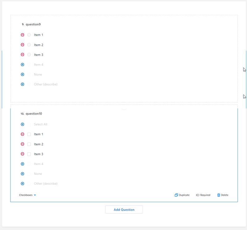
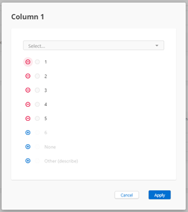
Add a Radio Button Group / Checkboxes / Dropdown List
You can add a question using Radio Group buttons, Checkboxes, or Dropdown items to the Form Designer canvas. The choice can be:
| Radio Button Group | Checkboxes | Dropdown |
|---|---|---|
|
|
|
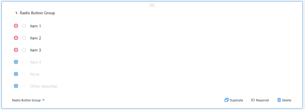
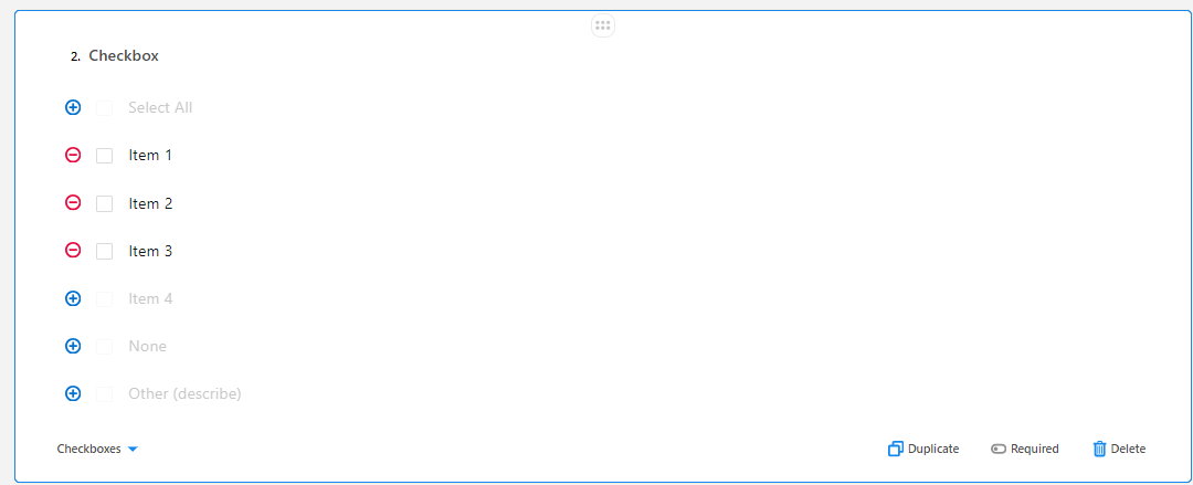
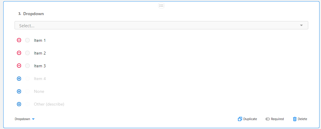
The process for adding the question type to the canvas is the same as is the process for adding additional items, deleting unused items, and defining custom text items.
-
Click either the Radio Button Group element, Checkboxes element, or the Dropdown element to add the question to the canvas.
-
Configure the items shown by clicking Item 1 to change the text.
-
You can delete the item by clicking
 .
.
-
-
If you require more items than what is shown, click
 to add another item and change the text label.
 -
Add the None item if no choices are required.
-
If you need an item for the form user to indicate that all the options can apply:
-
Click the blue circle next to Other (describe) to add an item with different text.
Example 1. Use if you want the form user to indicate that all the radio buttons applyAll of the above.
-
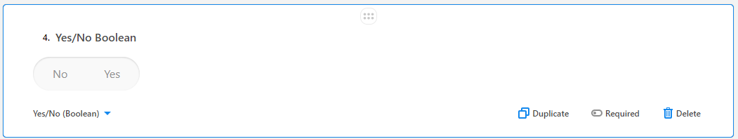
Add a Yes/No Question
-
Click the Yes/No (Boolean) element to add the question to the canvas.
-
Double-click in the No or Yes text labels if needed.
Example 2. Binary choicesYou can change the labels
to other binary choices such as:-
True/False
-
On/Off
-
Opened/Closed
-
Enabled/Disabled
-
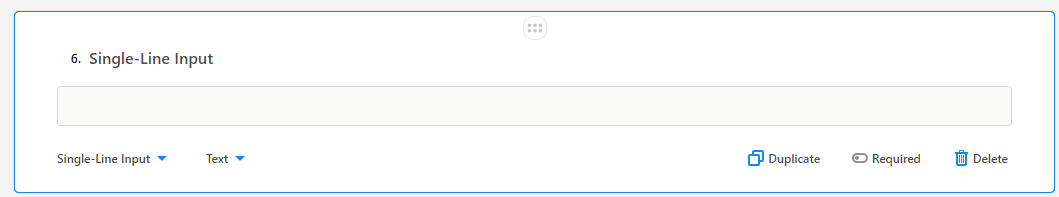
Add a Single-Line Input
-
Click and drag the Single-Line Input to add this to the canvas.
-
With the title text highlighted, change the text as desired.
-
Click Text and use the dropdown to change the format for the field.
Option Data type allowed Color
text background.
Date
mm/dd/yyyy
Date and Time
mm/dd/yyyy 00:00 XX.
XX = AM or PM
Email
email address
Number
numerical
Phone Number
Phone number format
Text
Default
Time
00:00 XX
XX = AM or PM
URL
Valid URL
Add a Long Text Input
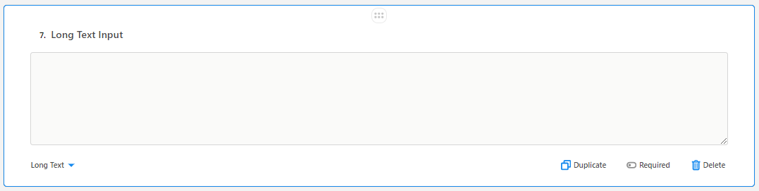
Click and drag the Long Text to the canvas to add user text long text box to the form.
Add a Multiple Text Box Element
Click and drag the Multiple Textboxes to add two text boxes to the form.
Add a Panel
-
Click and drag the Panel element to add it to the canvas.
-
Click Add Question to add an element within the panel.
Add a Dynamic Panel
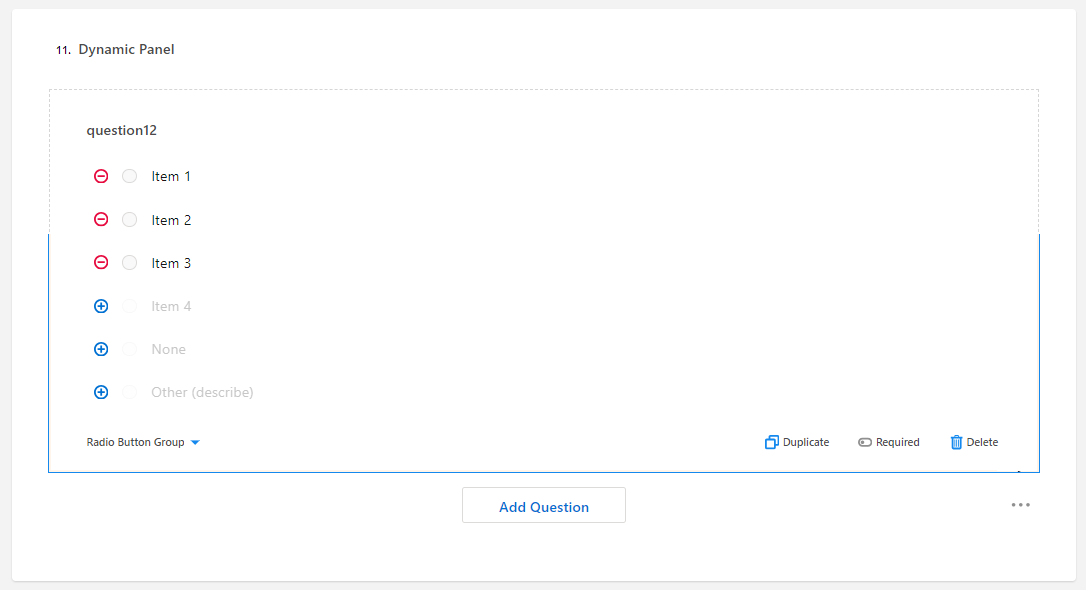
| Confirm your version of DataGuide supports Map Child Elements. Older versions of DataGuide had issues where this element couldn’t be used inside Dynamic Panels. There would be a failure to render or return a configuration errors. Later versions have fixed this and added support for the element within Dynamic Panels and improved form actions for child records. |
-
Click and drag the Dynamic Panel element to add it to the canvas.
-
Click the panel title to change the text as desired.
-
Click Add Question to add an element within the panel.
Add a Single-select Matrix
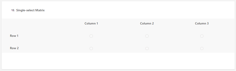
-
Click and drag the Single-select Matrix to add it to the canvas.
-
Click the column or row headers to change the text.
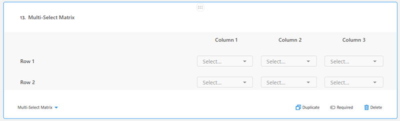
Add a Multi-Select Matrix
-
Click the Multi-select Matrix element to add it to the canvas.
-
Click the column or row headers to change the text.
-
Click the pencil icon in the cell to add items for a dropdown selection.
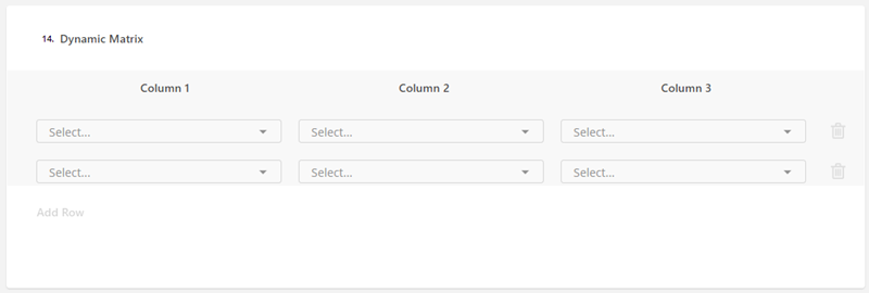
Add a Dynamic Matrix Element
-
Click the Dynamic Matrix element to add it to the canvas.
-
Click the column headers to change the text.
-
Click the pencil icon in the cell to add items for a dropdown selection.
-
If you need additional rows, click Add Row.
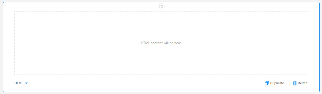
Add an HTML Block
-
Click the HTML element to add it to the canvas.
The form user can paste in HTML code to here.
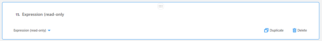
Add an Expression (Read-Only) Element
-
Click the Expression (Read-Only) element to add it to the canvas.
An Expression can’t be made to be Required.
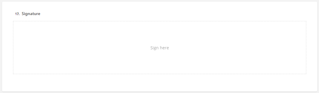
Add a Signature Block
-
Click the Signature element to add it to the canvas.
You can have multiple signatures on the form.
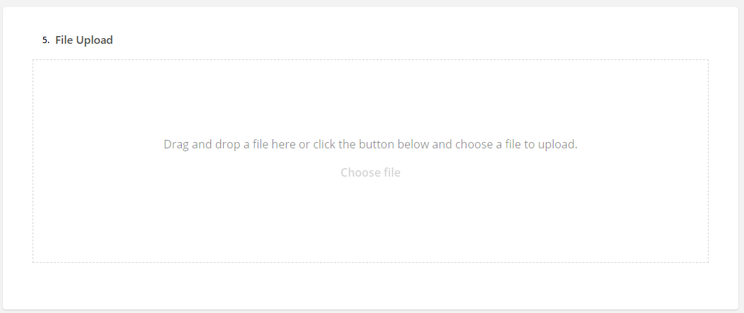
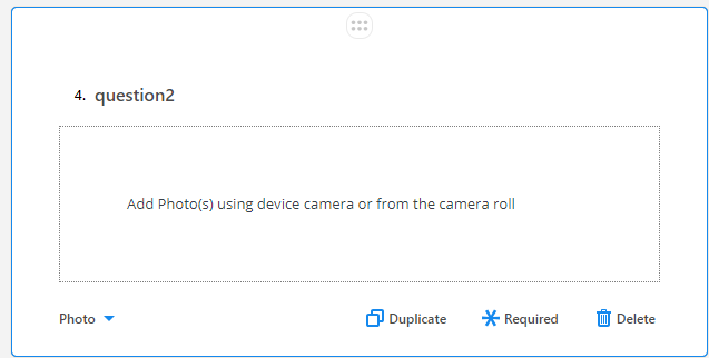
Add a Photo Block
Click the Photo element to add it to the canvas.
Once the form is publish and a Mobile user can access it, they can tap into the box and add a photo from their device or camera roll.
Add an SObject
| This element only appears if FieldFX is installed. |
-
Click the SObject Picker element to add it to the canvas.
-
To set the SObject, select the element with the SObject Picker.
-
Open the survey settings by clicking the
 icon.
icon. -
Either scroll down to SObject or use the Search field and type
SObject. -
At the SObject dropdown, select the SOBject you want to use.
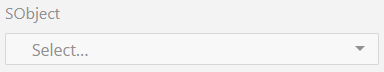
-
Either scroll through the list of SObjects or start typing the name of the SOBject in the Select… field.

Establish Form Translations
You can set the form, elements, and choices to be shown in another language.
You can import the translations options in csv format. and export the translation options in csv format.
You can change what is shown:
-
All Strings - All fields are shown
-
Used Strings Only - Shows the current language the fields are translated into. The default language is the language for the org.
Once you have the translations set, you can preview the form on a variety of devices.
Preview the Form
In the tab, you can see a preview of the form.
-
Use
 to open a search field.
 -
Select the device you want to preview the form.
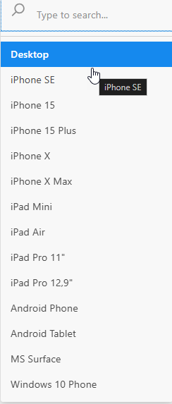
The Preview changes to show how it appears on the selected device.
Edit a Form
You can edit a form that is still in the draft stage. If you want to edit a published form, create a new version of that form, and then publish it.
| Once a form is in the draft stage, you can’t change the Object field. |
-
Open the Forms Manager.
-
Click on the desired form to open it in the Form Designer.
-
Click
 to customize the form settings.
 -
Click Publish to activate the form so users will be able to use it.