Form Designer
Introduction
-
The Form Designer creates one or more Form Versions of a Form.
-
The active Form Version of a Form is what an end user sees when they select a form.
-
The Form Designer includes a wide range of highly customizable form input options.
-
A form can be divided into multiple pages, and each page can have its own title.
-
Use logic built into the form to determine whether questions or form pages display and modify what a user sees on the form in real time as they fill out the form questions or inputs.
-
Some input types can allow the end user to add additional rows on the fly as they complete the form.
-
Forms tied to a job or ticket can automatically populate information from the record.
-
Test the form right inside the Form Designer to check how it will display to end users.
Prerequisites
To setup and use Form Designer, you need to:
| Have these user licenses | Have these permissions | Complete these tasks and review these topics before continuing |
|---|---|---|
Overview
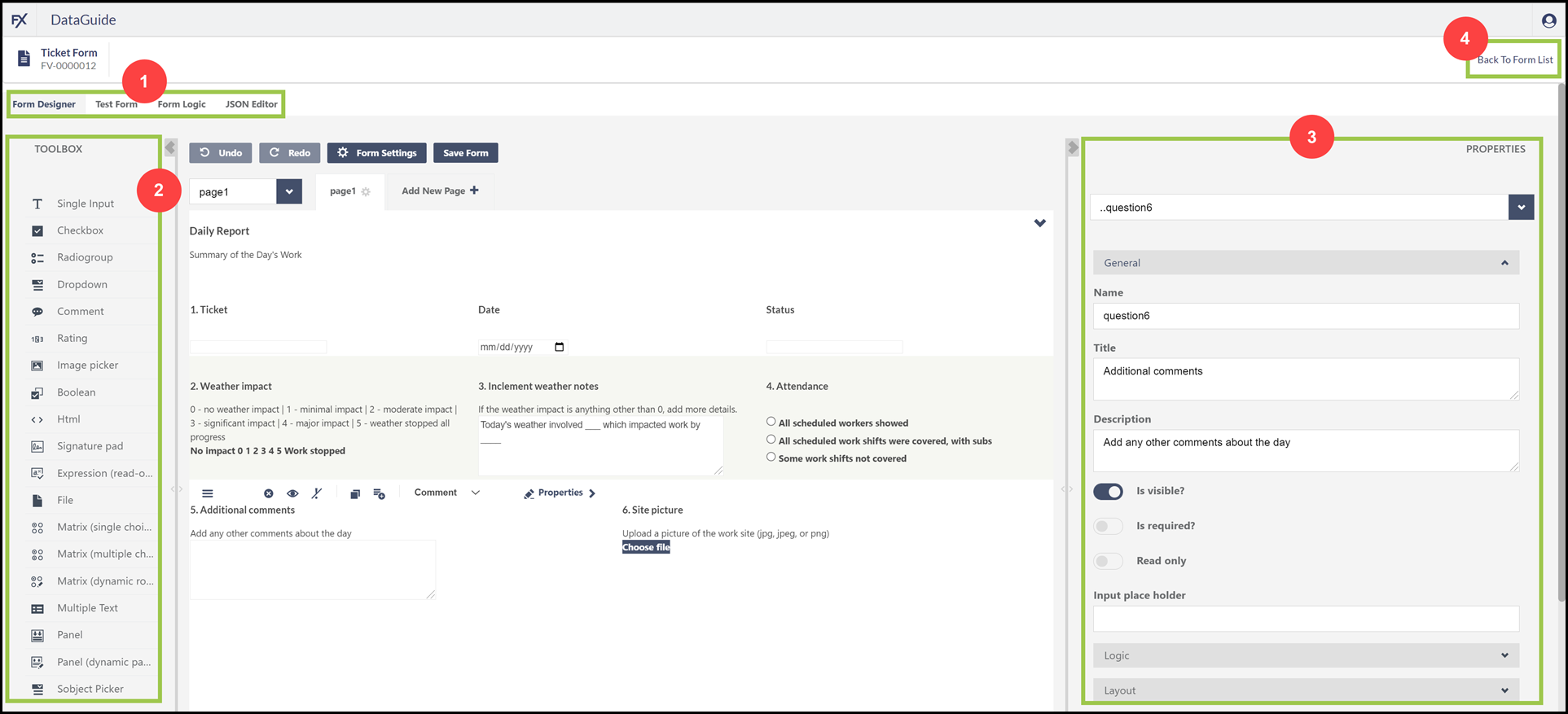
| Callout # | Description |
|---|---|
1 |
Four tabs give access to the Form Designer, the Test Form feature, Form Logic builder, and an advanced option to modify the form’s JSON directly |
2 |
The Toolbox includes all of the input options available to add to the form |
3 |
Use the Properties panel to make changes to the last selected element, such as the form settings, page information, or particular input. + Options vary depending on the element selected on the form. |
4 |
Select Back to Form List to leave the form without saving any changes and return to the DataGuide Dashboard |
Getting There
You can create, modify, and archive Form Versions in the Admin Portal.
-
Go to https://admin.fieldfx.com.
-
Select whether to create forms in a Sandbox or Production org.
-
If necessary, enter the appropriate Salesforce credentials for the org.
-
Select DataGuide from the Miscellaneous section of tools.
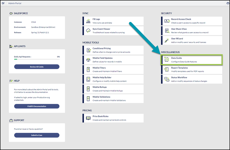
The Admin Portal’s Dashboard is responsive, so the DataGuide button may appear in a different location on your screen.
-
Select a form from the DataGuide Dashboard.
-
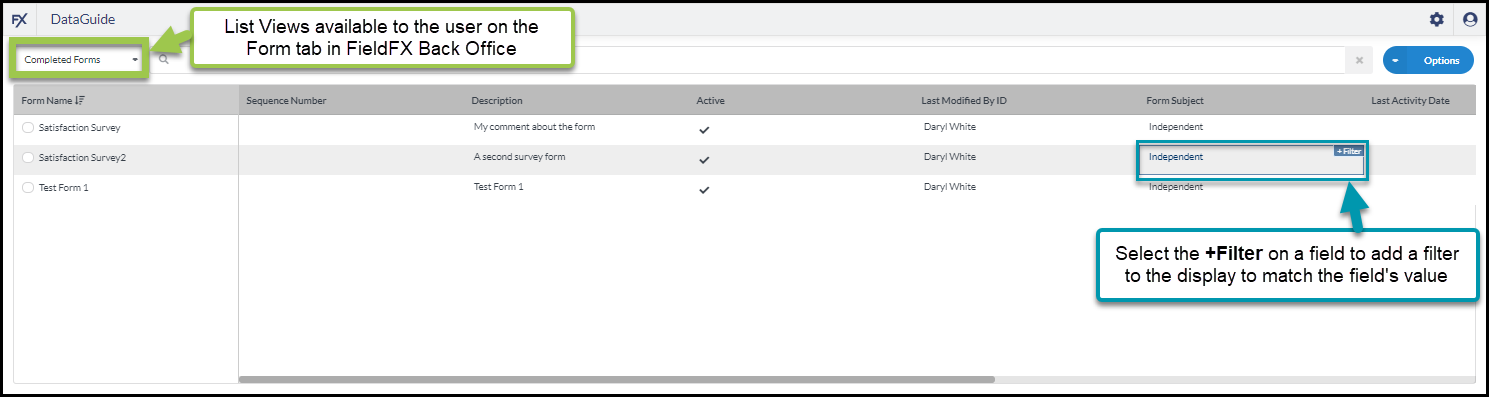
The columns that display on the forms list depend on the List View for the user for the Form tab in FieldFX Back Office
-
The user can switch to a different List View, if available, using the dropdown to the left of the search box at the top of the screen
-
Add a filter to limit which forms display in the list by clicking in any field with the desired value to filter by, then click the blue +Filter button that displays.
-
When the user selects a Form’s radio button, a panel displays on the right side of the screen with details about the form and access to the form’s Form Versions.
-
-
On the right side of the screen, select the Versions tab.
-
Select an In Progress form version to modify.
If no In Progress form version is available, create a new Form Version, then select it.
-
Hover over the arrow to the right of selected form version, then select Edit.
The Form Designer screen displays.
Form Designer
Use the Form Designer as a WYSIWYG (what you see is what you get) method to create your form. Click on a question or input type from the Toolbox on the left panel and drag it on to the form in the middle of the screen to add it to the form.
-
Set the Properties of the question or input using the panel on the right.
You can also click many elements on the form and modify them right on the form without going to the Properties panel.
-
Select Add New Page + to divide the form into multiple pages that display in sequence to the end user.
Use the Form Logic tab to create rules for how the form pages flow as the end user completes the form.
Define Form Settings
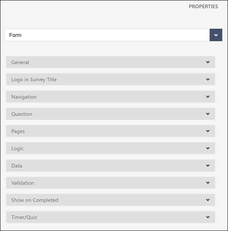
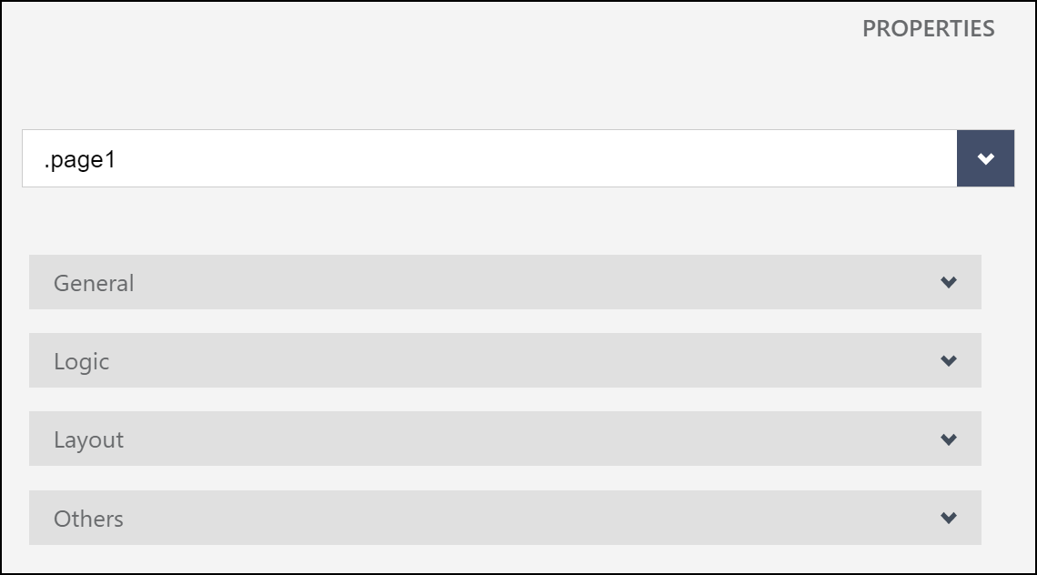
Form settings are defined in ten groups of options in the Properties panel.
|
|
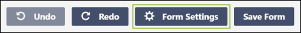
Once in the Form Designer, click the Form Settings button.
|
Or you can use the top drop down in the Properties panel and select Form. |
General
| Field | Description | ||
|---|---|---|---|
Title: |
Appears at the top of the page for the form.
|
||
Description: |
Additional information for the form that displays at the top of the form page. |
||
Show/hide title: |
Checkbox to indicate whether to show the Title and Description on the form. |
||
Default language: |
Select the language for the form’s contents. |
||
Mode: |
Edit to allow the user to make entries in the form or Display to prevent users from making entries to the form. |
||
Cookie name (to disable run survey two times locally): |
Add a name for the cookie file to add to the user’s device. When a cookie is present, the user cannot complete the same form a second time on their device. |
Logo in Survey Title
Add a logo to display on the form’s page(s).
|
If you aren’t using a logo for the form, you can skip this section. However, if you add a logo, you must also add a Title in the General section. |
| Field | Description | ||||||||
|---|---|---|---|---|---|---|---|---|---|
Logo: |
This field contains the base64 string for the logo image uploaded on the form.
|
||||||||
Logo position: |
Where to display the logo in relation to the title in the title section, either left, right, top, or bottom. Select None to not display the logo. You can then select Remove Logo… on the form. |
||||||||
Logo width: |
Set the width in pixels for the logo to use on the screen. Larger logos scale down proportionally to fit in the defined width. Smaller logos display at the file’s actual size, and then include a margin around the image to the defined Logo width. |
||||||||
Logo height: |
Set the height in pixels for the logo to use on the screen. Larger logos scale down proportionally to fit in the defined height. Smaller logos display at the file’s actual size, and then include a margin around the image to the defined Logo height. |
||||||||
Logo fit: |
Define how the logo should use the defined Logo width and Logo height.
|
Navigation
You can optionally use these options for how the user interacts with the form.
| Field | Description | ||||||||||||
|---|---|---|---|---|---|---|---|---|---|---|---|---|---|
Show preview before complete: |
Enable the user to display a read-only view of the form.
|
||||||||||||
Page previous button text: |
Label to use on the button that allows a user to go to the prior page of the form. |
||||||||||||
Page next button text: |
Label to use on the button that allows a user continue to the next page of the form. |
||||||||||||
Complete button text: |
Label to use on the button that allows a user to mark the form as completed. |
||||||||||||
Preview button text: |
Label to use on the button that allows a user to display a read-only view of the form with answers, if any. |
||||||||||||
Edit button text: |
Label to use on the button that allows a user to make changes to a read-only display of the form. |
||||||||||||
Start button text: |
Label to use on the button that allows a user to begin entering information on a form. |
||||||||||||
Show navigation buttons (default navigation): |
Where on the form page to display navigation buttons to a user:
|
||||||||||||
Show previous button (user may return on previous page): |
Allow the user to return to a previously displayed page of the form. |
||||||||||||
The first page in the survey is a started page.: |
Select to indicate that the first page of the form is for display purposes only.
|
||||||||||||
On answering all questions, go to the next page automatically: |
select this option to automatically advance the form to the next page when the user answers all input questions on the form page. |
||||||||||||
Show progress bar: |
Whether and where to display a visual indication of the user’s progress in completing the form.
|
||||||||||||
Progress bar type: |
If Show progress bar is selected, select the measure to use for progress.
|
||||||||||||
Questions on page mode: |
select how to present the form’s questions to the user.
|
Questions
You can optionally define the default settings for the form’s questions.
| Field | Description | ||||||||||
|---|---|---|---|---|---|---|---|---|---|---|---|
Question title location: |
Select top, bottom, or left for where the title of the question should display in relation to the remainder of the question description and input options. |
||||||||||
Question description location: |
Select underTitle or underInput to set the default for where a question’s description displays. |
||||||||||
Show question numbers: |
select an option for how to number questions through the form.
|
||||||||||
Question title pattern: |
specify where to place the required indicator in relation to the number and question title
|
||||||||||
The question required symbol(s): |
enter a character or string to include in the question number and title for questions marked required. The placement of the specified character(s) is specified in the Question title pattern option. |
||||||||||
Question start index: |
Enter the starting character or number for the first question. Questions automatically increment their numbering from the starting entry. If you enter a character, it can be either upper case or lower case.
|
||||||||||
Question error location: |
Select whether error messages display at the top or bottom of the question’s input when an answer does not pass validation. |
||||||||||
Focus first question on changing the page: |
select to automatically select the input box for the first question on the page when the user navigates to a new page in the form. |
||||||||||
Elements order on the page: |
|
Pages
You can optionally choose how the form’s Pages display to the user or define these options from the tabs on the form view.
For each page, define:
| Option | Action |
|---|---|
Name: |
The value that displays on the page tab in the form. |
Title: |
The value that displays at the top of the form page above the questions.
|
Show page titles: |
Select the checkbox to show the page’s Title at the top of the form page. |
Show page numbers: |
Select the checkbox to add the page number to the page’s title. |
Logic
You can optionally add logic rules to calculate values or run expressions based on triggers.
-
Use Calculated values to take responses to questions and compile them or perform math functions to create a new value.
-
Store the value in a separate variable, and then use the value to populate an answer to a question on the form or as part of a Trigger.
-
Expand the Logic section of the Form Settings properties.
-
Click Add New.
-
Assign the new Calculated Value a variable Name.
-
Add the Expression for how to calculate the variable.
-
You can add additional Calculated values variables as needed.
-
Select the X next to a calculated value to delete it or select Remove All to delete all Calculated values.
-
-
Use a Trigger to take an action on the form based on logical criteria.
Triggers can also be viewed, added, or modified in the Form Logic tab’s Actions section.
For example, create a variable with a Calculated value. When the value of the variable falls within a certain range, a Trigger can run to set the value of another question on the page.
-
Use the dropdown under Triggers to select an existing trigger to modify.
or
Click the + button to add a new Trigger.
-
If adding a new Trigger, select the type of action you want the trigger to perform depending on the selected calculated value:
complete survey:
mark the form complete when the trigger’s criteria are met.
set value:
set the value of another variable or question when the trigger’s criteria are met.
copy value:
copy a value to a variable or question when the trigger’s criteria are met.
skip to question:
advance the user to a selected question when the trigger’s criteria are met.
run expression:
run a logical sequence when the criteria are met when the trigger’s criteria are met.
-
Use the fields in Build to create the criteria for when the Trigger should run.
or
Click Edit to directly enter an expression manually.
-
Select Add condition to create additional rules for when to take the action, linking them with either the And or Or operators.
-
Click Remove to delete the criteria.
or
Click the red X button to delete the entire trigger.
Data
You can optionally choose what should happen with the answers to the Form’s questions.
Clear invisible values: |
|
||||||||
Text update mode: |
choose when to update the stored response to a question.
|
||||||||
Send survey results on page next: |
select to set survey results with each page. |
||||||||
Store 'others' value in separate field: |
Validation
You can optionally select the behavior of the form when there are invalid answers.
Focus on the first error: |
automatically move the user’s cursor to the first question with an invalid response. |
||||||||
Check errors mode: |
select when to validate responses:
|
Show on Completed
You can optionally choose what the user sees after completing a form.
Navigate to url: |
enter a URL to display in the device’s browser. |
Show the completed page at the end (completedHTML): |
select to display content defined in the Completed html section. |
Completed html: |
Enter the HTML content to show to users if the Show the completed page at the end is selected. |
Navigate to url on condition: |
select Add New to define different web URLs to display depending on defined logical expression(s). |
Completed html on condition: |
select Add New to define different HTML content to display depending on defined logical expression(s). |
Loading html: |
HTML content to display while the form loads. |
Completed before html: |
HTML content to display to users who have previously completed the form. |
Timer/Quiz
You can optionally set limits on how long the user can take to complete the form.
Maximum time to finish the survey: |
enter the number seconds a user can take to complete the entire form. |
||||||
Maximum time to finish a page in the survey: |
enter the number of seconds a user can take to complete each page of the form. |
||||||
Show timer panel: |
|
||||||
Show timer panel mode: |
whether to display the timer data for the page, the form, or both
|
Define Page Settings
Page settings are defined in four groups of options in the Properties panel.
-
Once in the Form Designer, click the tab for the page whose properties you wish to modify.

Or you can use the top drop down in the Properties panel and select the desired page.
-
Make changes to basic page settings in the General section.
Name:
enter a name for the page to use on the form tab.
+
The Name is used on the form tabs, when referring to the page in the Expression Builder, and in navigating the Form Designer screens.
Title:
Displays to the user at the top of the form page.
Description:
Additional info to display to the user under the page’s Title.
Is visible?:
Select whether the form loads with the page visible to the user.
This can be changed as the user fills out the form with the Expression Builder.
Read only:
Select whether the form loads with the page editable by the user.
This can be changed as the user fills out the form with the Expression Builder.
Maximum time to finish the survey:
Enter the number of seconds the user has to complete the page.
Leave the value at 0 to not have a time limit.
-
(Optional) Change whether the page is visible or accessible in the Logic section.
Visible if:
Enter an expression to use to make the page visible.
Enable if:
Enter an expression to use to make the page editable to the user.
-
Modify how questions end page elements display in the Layout section.
Use these options to override the Form’s Layout settings for a page. Question title location:
Specifics where to display the title of each question in relation to the question contents.
default:
Use the Form’s question title value.
top:
Displays the title above the user’s response to the question.
bottom:
Displays the title below the user’s response to the question.
left:
Displays the title to the left of the question contents.
hidden:
Doesn’t display the question title to the user.
Elements order on the page:
Enter an expression to use to make the page editable to the user.
default:
use the Form’s value.
initial:
always display the questions in the same order.
random:
change the order of the questions each time the form is used.
Navigation buttons visibility:
Select whether to display navigation buttons to the user.
inherit:
use the Form’s value.
show:
display navigation buttons for this page.
hide:
do not display navigation buttons for this page.
For example, to navigate to the next page automatically based on form logic.
-
Set options for requiring the page in the Others section.
Required if:
Enter an expression to make the page required.
Add Questions and Customize Question Properties
The FX DataGuide Form Designer is a drag-and-drop, WYSIWYG (what you see is what you get) interface. There are nineteen types of questions you can add to a form. See below for more details. After adding a question, you can modify, delete, or move questions around on the layout panel. Define options for the questions in the Properties Panel on the right side of the screen.
| Select the question on the form layout panel or use the drop down at the top of the Properties panel to select the question to modify. |
Adding a Question
Select a question from the Toolbox on the left side of the screen and drag it onto the form layout where desired.
Define Question Properties
|
The properties and property groups available vary based on the type of question selected. Not all properties are available to all question types and are described below. |
-
Select a question to modify on the Form Designer’s layout panel.
or
Use the dropdown at the top of the Properties panel to select a question to modify.
-
Define basic question options in the General section.
Name:
Enter a short text to use for referring to the question in expressions, drop downs, and other aspects of the Form Designer.
Title:
Enter text that can display to the form user; this can be the question.
The Title can be set to not display to the user, and it can be displayed above, to the side, or below the question’s response.
Description (optional):
Question or additional information about the question to display to the user.
In visible?:
Toggle whether to display the question to the user when the form loads.
You can use Form Logic to change a question’s visibility based on other responses on the form.
Is required?:
Toggle whether the user must enter a response before completing the form.
You can use Form Logic to change whether a question should be required as the user fills in the form.
Read only:
Toggle whether the user can modify the response to the question.
You can have the response to a question calculate automatically or copy from another question, and entry by the user may not be required.
You can also use Form Logic to change whether a question should be editable by the user as they fill out the form.
Input type:
Select the type of entry expected from the user.
Some selections change how the user interacts with a form.
For example, selecting a date type prompts the device to display a calendar option to the user instead of straight entry.
Input place holder:
Text to display to the user when the form first loads.
Has comment:
Adds a long text field for the user to add additional text to the response.
Auto complete:
Not used by FX DataGuide.
This option is used in other implementations to automatically fill in a form response with data known about the user.
Use the sObject type instead to select values from a related Job or Ticket lookup.
-
(Optional) Add expressions to control the user’s interaction with the question in the Logic section.
Visible if:
The question displays only if the expression evaluates to
True.Enable if:
The user can modify the response to the question only if the expression evaluates to
True.Required if:
The user must add a response to the question if the expression evaluates to
True.Default value expression (?):
Value to use for the response to the question.
-
Control settings for how the question displays in the form in the Layout section.
Page:
Select the page the where the question should appear
Is start with new line?:
Select to have the question start on the left side of the form on a new line or leave deselected to allow the question to display to the right of the previous question.
Hide number:
Select to not display the question’s sequential number to the user.
State:
For panel questions, select whether it displays expanded or collapsed.
Title location:
Select where in relation to the response the question’s title should display, or choose to not display the question’s title.
Description location:
Select where the question’s description should display.
Default:
Use the form’s default description location.
Under Input:
Shows the description under the response the user enters.
Under Title:
Shows the description under the question title.
Indent:
A number from 0-3 to increase the left padding for the question.
Min width:
Minimum width for the question to take up on the user’s device, in CSS format (%, px, em, etc.).
Use this option to prevent the question from truncating into small lines of text.
Max width:
Maximum number of pixels wide for the question to use, in CSS format (%, px, em, etc.).
Column count:
For radiogroup and checkbox questions, specify the number of columns to use for options.
Allow clear:
For signature pad, enables a clear button to erase the drawn signature and try again.
Pen Color:
For signature pad, the color to use for the line drawn.
+ Select a color, use the color picker, or enter RBG values to use.
Data format:
For signature pad, the image format to use for the captured signature (PNG, JPEG, or SVG).
-
You can optionally choose options for question responses in the Data section.
Value name:
Variable name to use to store the response separate from the question name.
For example, this is useful if the same response is used for more than one question.
Default value:
Initial value to use for the response.
Default formula:
Correct answer:
Specify the answer the user should enter or select.
Use display values in title:
Select to use the title of a referenced question in the selected response.
Text update mode:
Select when to store response to the form data.
default:
use the Form’s settings.
onBlur:
store after the user leaves the response field.
onTyping:
store with each character entry by the user.
The onTyping option may cause degraded performance.
-
Choose options if users skip required questions or to verify entered data in the Validation section.
Required error text:
Enter the message to display to users if the required question is missing a response.
Validators:
Select the type of validation to run against the response.
expression:
Enter an expression to test the response that must evaluate to
True.numeric:
The entry must be a number and fall within the specified minimum and maximum range.
text:
The response must have a number of characters within the specified character count range.
answercount:
Verifies user has selected a number of responses within a specified range, such as for multiple-select checkboxes.
regex:
Checks that the response follows the format defined by the entered regular expression.
e-mail:
Response must be a correctly formatted e-mail address.
Depending on the validation type selected, additional fields display.
-
Specify Other options for some question types.
Width:
CSS style-formatted width value for the question.
Question Toolbox
FX DataGuide’s Form Designer provides 19 types of input options in the Toolbox:
| Question Type | Description | Additional Features |
|---|---|---|
Single Input |
Allows the user to make a single entry. |
color, date, datetime, datetime-local, email, month, number, password, range, tel (telephone), text, time, URL, or week |
Checkbox |
Provides a list of options. Users can select multiple choices. |
Use validations to check that the user selects the desired number of options. |
Radiogroup |
User selects one of several displayed options. |
An "Other" option can be added, allowing the user to input their own answer instead. Form properties control how an other entry passes in the data. The list of options can be taken from the selected items, unselected items, or all items that form the list in another question. For example, you want users to select three of ten options. Questions 1 lists all 10 options, question 2 lists the 9 unselected options from question 1, and question 3 lists the eight unselected options from question 2. Options can also be taken from the web, but use caution on forms that are used on mobile devices and may not have an available Internet connection. |
Dropdown |
User selects a dropdown, and then chooses selects a value from the provided list. |
An "Other" option can be added, allowing the user to input their own answer instead. Form properties control how an other entry passes in the data. The list of options can be taken from the selected items, unselected items, or all items that form the list in another question. For example, you want users to select three of ten options. Questions 1 lists all 10 options, question 2 lists the 9 unselected options from question 1, and question 3 lists the eight unselected options from question 2. Options can also be taken from the web, but use caution on forms that are used on mobile devices and may not have an available Internet connection. |
Comment |
An open entry text box a user can fill in as desired. |
|
Rating |
User selects a number value from a provided range. |
|
Image picker |
User selects one option from a list of images. |
The image must be an image link accessible to the user, be careful for mobile users who may not have Internet access when completing a form. |
Boolean |
Provides a toggle the user can use to select one of two different options. |
|
Html |
Displays HTML contents to the user. |
Can be used to display or hide instructions to the user depending on their responses to other questions using the Visible if option for the question. |
Signature pad |
Accepts a signature drawing as input. |
|
Expression (read-only) |
Runs an FX DataGuide expression. |
For example, to calculate and display a total or date age based on responses to other questions. |
File |
Allows the user to upload a file to the Form. |
You can specify what file types to allow for uploading in the question properties, whether to allow preview for image file types, and how to add the content to the form’s JSON data. For example, limit uploads to picture format types, or only to Microsoft Word document types. |
Matrix (single choice) |
User selects one option from a table of cells (with both columns and rows). |
|
Matrix (multiple choice) |
User selects one or more options from a table of cells (with both columns and rows). |
|
Matrix (dynamic rows) |
User selects options from a table of cells and may add additional rows as needed while completing the form. |
|
Multiple Text |
Accepts multiple, separate inputs from the user. Each input may be a different data type. |
See the Text type question for the available entry types. |
Panel |
Set of nested questions |
A Panel can contain any of the other question types within it. |
Panel (dynamic panels) |
Set of nested questions that a user can then choose to duplicate, which takes all of the questions nested in the panel and creates copies of them for the user to answer |
|
Sobject Picker |
User selects a lookup value |
Only valid for Job and Ticket type Forms. |
Test Form
The Test Form tab allows you to see how the form displays to end user. The form works as it would for the user, including any logic or expressions used to control when questions display.
|
Any sobject question types do not display any data, as there is no linked record from the Form Designer. |
-
Select options for how to test the form:
-
Select the page to test it: use the dropdown to navigate to a specific page for testing
-
Show invisible elements: Select the checkbox to display questions that are hidden
Some question types rely on logic built into the form to change them to display to the user. Override that with this setting to see the question(s) anyway.
-
Choose device: Select a device to see how the form might display to users on the selected device
-
Options include a desktop, various iPhone and iPad versions, Android phones, Android tablets, or Microsoft Surface
-
-
-
Make entries in the form’s questions to test that the form’s logic, expressions, and flow work as intended.
Form Logic
Form Logic determines how the form flows as the user fills out responses to the questions.
-
Create a condition or set of conditions to trigger how the form should react.
-
When the condition(s) evaluate to True, the defined action occurs.
Actions can also be created from the Properties Panel for a Form in the Logic section by adding a Trigger.
-
You may create as many Condition and Trigger rules as needed.
Create or Modify a Rule
-
From the Form Designer, select the Form Logic tab.
-
Select Add New to create a rule.
or
To modify an existing control, select the pencil icon to the left of the rule.
-
In the Define condition(s) section, create an expression to evaluate.
-
(Optional) If using the Build tab to add the expression, select Add condition to create additional rules.
You choose whether multiple conditions should be linked by And or Or logic.
-
(Optional) If using the Build tab, you can review the built expression in the Edit tab to further customize it or make use of advanced expression functions.
-
-
Use the Define action(s) section to select what should happen when the rule(s) evaluate to
True-
The logic can control any of the following form properties:
Page visibility:
toggle whether a specified page of questions displays to a user.
Question visibility:
toggle whether a question displays to a user.
Question enable/disable:
toggle whether the user can answer a question.
Question optional required:
toggle whether the user must answer a selected question.
Complete survey:
immediately mark the survey complete.
You can’t modify completed surveys.
Set question value:
Update a specific question to a specified answer.
Copy question value:
Copy the response to a selected question to a different question.
Skip to question:
Move the user’s cursor to a specified question.
Run custom expression:
Perform a custom logic created in the expression builder.
Custom "Thank you" page text:
Change the thank you page that displays when a user completes the form.
This option presents a blank long text field into which you can type or paste the HTML content to use.
-
Each option has additional fields to complete that vary based on the type of action to take, including one or more of the following:
Select page:
specify the page to change.
Select question:
specify the question to use for the action.
Set value:
specify the value to use for the question.
The options for value change depending on the type of data in the selected question.
Set to name:
The question whose response should change for the Copy question value action
From name:
The question whose response should be copied from for the Copy question value action
Goto name:
The question to which the user’s cursor should move for the Skip to question action
Run expression(?):
Contents of the expression to use
-
(Optional) Select Add new action to perform more than one action for the same set of conditions
-
-
After creating the condition and action, select one of the following:
-
Save and return: Save the logic rule and return to the list of Form Logic
-
Save: Save the logic rule and continue editing the rule
-
Return without saving: Ignore any changes and return to the Form Logic screen
-
JSON Editor
The Form Designer saves the form as a JSON document. Advanced users can access the JSON Editor and modify the JSON content directly. Don’t use for modifying form content.
Recommended Reading
-
FX DataGuide Overview - Learn the basics about FX DataGuide
-
Expression Builder - Learn how to use Expressions to customize or automate FX DataGuide form completion.
-
Use FX DataGuide Forms - Learn how to input data into FX DataGuide forms
-
FX DataGuide Setup - Learn how to setup FX DataGuide.
-
FX DataGuide Minimum Permissions - Learn about the minimum permissions required to use FX DataGuide.