FXL Data Grid Setup
Introduction
| For clarity and simplicity, the FXL Data Grid v2 will simply be referred to as the FXL Data Grid. |
When selecting the Lightning component, select the grid with "v2" appended to the name.
The FXL Data Grid is a versatile record management tool in FieldFX Back Office when using Lightning Experience. You can set up an FXL Data Grid for use with any record type in FieldFX. You can also set up FXL Bulk Editing, FXL Stage Pricing, and the FXL Bundle Maker for use with an FXL Data Grid after you have already added and configured it.
|
To use the FieldFX Lightning package starting with version 1.291, you must use the FieldFX Managed Package version 1.672 or higher. To find the version numbers you have installed, see Check Version Number for FieldFX Managed Package and FieldFX Lightning Managed Package. |
After you have setup the FXL Data Grid, you can also:
-
FXL Setup FXL Bulk Edit and dependent lookup fields
-
Setup FXL Bundle Maker
Prerequisites
To set up the FXL Data Grid, you need to:
| Have these user licenses | Have these permissions | Complete these tasks, some if using for the first time, and review these topics before continuing |
|---|---|---|
|
|
| Without permission to this Visualforce page, users will not be able to view the FXL Data Grid v2. |
Set Up FXL Data Grid
|
This grid only applies to Back Office and does not change what displays in Field FX Mobile. To see what determines what a user sees in the mobile app, see Configuring FieldFX Mobile Screens. |
-
Switch to the Lightning Experience.
-
Access the applicable record page.
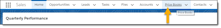
Example 1. Use the FXL Data Grid to manage Price Book Item recordsScenario
You want to use the FXL Data Grid to manage price book item records.
-
From your Home page, click Price Books.
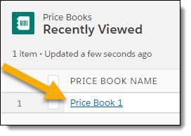
-
Click the price book for which you want to use the FXL Data Grid to manage price book items.
-
-
Complete the following before moving to the next step:
-
Set up Bulk Editing to be used with the FXL Data Grid.
-
Set up Stage Pricing to be used with the FXL Data Grid.
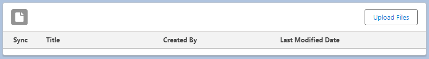
Add the FXL File Viewer Lightning Component
You can add the FXL File Viewer Lightning Component to a Job or Ticket page.
-
In FieldFX Back Office, select either a ticket or a job.
The process for adding the FXL File Viewer is the same for both. -
Click
 and select Edit Page.
The Lightning App Builder opens up.
-
Under Components, use the Search field and search for
fxl_file_viewer. -
Drag the component to a section on the record page.
-
You can add one or more optional filters for this component to filter the files shown.
-
Click Save.
-
Click Activation...
The Activation: Ticket Record Page window appears. If you have added the component to the Job Record Page, the title of the window is Activation: Job Record Page.
-
Click Close.
-
Click the return arrow to exit the Lightning App Builder and return to the Record Page.
The FXL File Viewer appears on the Record Page.
Configure Grid Details
The API names of Salesforce objects and object fields are required to configure any of the FXL Data Grid fields. The most accurate way to enter the API names is to obtain them from the Object Manager or from workbench.
| When working with the grid layout for the Delivery and Return Tickets in the latest Rental package, the Print button can’t be changed when configuring the ticket grids. |
|
The FXL Data Grid supports the use of and displays image fields as read-only. |
The examples are from Tickets and Quotes because these objects are very commonly used with the Grid. However, the grid is not limited to these objects and can be used with any object.
Disable Options
You can use these four options in the FXL Data Grid in the Disabled Grid Feature field either by themselves or in a comma delimited list:
| Option | Description |
|---|---|
GRID VIEWS |
Removes the user’s ability to change the sort criteria and to create a custom view allowing them to remove the stage number column. Enter 'Grid View' in the Disabled Grid Feature field. To re-enable, remove |
ROW SELECTION |
Enter To re-enable, remove Row Selection and tab away from the field. 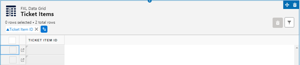
The indicator for the number of rows that were selected is removed, there are no checkboxes for the rows, and Delete button is not shown. 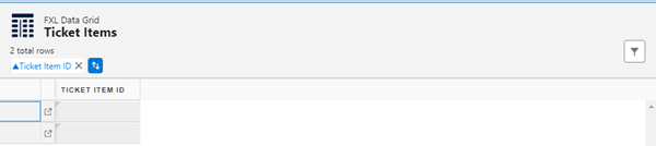
With Row Selection and select the Disable multi-select and use single select checkbox, No radio button is displayed. 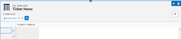
|
DELETING ITEMS |
Removes delete button Enter To re-enable, remove |
FILTERING ITEMS |
Removes filter button Enter To re-enable, remove |
SORTING ITEMS |
Removes the sorting information from the header row. The grid column sorting is disabled. Enter To re-enable, remove |
Choose Columns for User Custom Views
| You must be an organization admin to set the columns a user can see and use for a custom view. |
-
Switch to the Lightning Experience.
-
Access the applicable record page.
Design Time Attributes
Design Time Attributes are divided into these subcategories:
|
|
For more information on these categories, see Configurable Fields in the FXL Data Grid v2 Configurable Fields.
Customize the Grid Heading and Title
You can customize the Grid Heading and Grid Title fields for the FXL Data Grid v2 on any records page where it’s used. If you leave these fields blank,
-
The Grid Heading defaults to
FXL Data Grid -
The Grid Title defaults to the item’s object label.
These properties also support using an expression to define its custom label. The correct format is (!$Label.customLabelName).
Create Custom Filters
We added the ability to create custom filters for a grid’s lookup fields.
Custom filters override Salesforce filters for lookup fields.However, you cannot save values if you try, a validation error results.
|
Custom filters are not supported for bulk edit. When adding new columns to a new lookup view, add the same columns to the default grid view. The new columns appear at the end of columns. If the user doesn’t have a default grid view, the columns will appear in the order they were entered in the settings. |
-
Create a Static Resource file named
fx_GridV2_CustomSearch.js -
Copy the sample file contents and then customize it for your needs
fx_GridV2_CustomSearch.jswindow.fx_GridV2_CustomSearch = { uid: { // [Unique ID of the grid] Contact_StartS__c: { // [Field Api Name] FX5__Contact__c: { // [Field Api Name] QueryFilter: "(LastName=NULL OR LastName LIKE 'S%')", // [Filter] QueryFields: "Name,LastName,FirstName", // [Display fields on lookup object] KeywordSearchFields: "LastName", // [Search fields on lookup object] OrderBy: "LastName" // [Sort field on lookup object] } }, // Multiple fields can be specified }, // Multiple grids can be specified };
| Custom filters allow for advanced queries.These queries can provide finely tuned results that are not possible apart from these programmatic custom filters. |
Advanced Custom Filter Scenario
|
The example scenario utilizes several additional fields and objects beyond standard FieldFX installations. Service Locations are not a standard feature of FieldFX. This example shows the power of custom filters beyond standard Salesforce capabilities. |
Scenario
When working with a Ticket, a field worker must select the service location where the work is performed, but should only see a list of service locations that are valid for the matching quote. Service Location appears on multiple grids on the Ticket object’s page layout.
window.fx_GridV2_CustomSearch = {
  qiball: { // [Unique ID of the grid]
    Service_Location__c: { // [Field Api Name]
      Service_Location__c: { // [Field Api Name]
        QueryFilter: "Service_Location__c=true AND Status__c!='Inactive' AND (Id IN (Select Service_Location__c from BTSL__c where Bill_To__c = '@@FX5__Quote_Item__c.FX5__Quote__c.FX5__CustomerAccount__c@@' AND Is_Active__c=true))", // [Filter]
        QueryFields: "Name,AMS_ID__c,BillingCity,BillingState", // [Display fields on lookup object]
        KeywordSearchFields: "Name,AMS_ID__c", // [Search fields on lookup object]
        OrderBy: "Name" // [Sort field on lookup object]
      }
    },
    // multiple fields can be specified
  },
  tiball: { // [Unique ID of the grid]
    Service_Location2__c: { // [Field Api Name]
      Service_Location2__c: { // [Field Api Name]
        QueryFilter: "Service_Location__c=true AND Status__c!='Inactive' AND (Id IN (Select Service_Location__c from BTSL__c where Bill_To__c = '@@FX5__Ticket_Item__c.FX5__Ticket__c.FX5__Job__c.FX5__CustomerAccount__c@@' AND Is_Active__c=true)) AND (Id in (Select Account__c from Territory_Assignment__c where Territory__c = '@@FX5__Ticket_Item__c.FX5__Ticket__c.Territory__c@@' and Status__c='A'))", // [Filter]
        QueryFields: "Name,AMS_ID__c,BillingCity,BillingState", // [Display fields on lookup object]
        KeywordSearchFields: "Name,AMS_ID__c", // [Search fields on lookup object]
        OrderBy: "Name" // [Sort field on lookup object]
      }
    },
    // multiple fields can be specified
  },
  // multiple grids can be specified
};
Create a Filter for Child Items
You can create a filter to:
-
To only see the Child Items that applies to child items only. Show only Child Items where Returned = true.
-
Combines parent and child item criteria. (For example, I want to see parent items with record type equipment and child items that have not been returned).
|
A child item filter can only be created if the API Name of the Parent Column is filled out. An error message appears when saving is ok. If the filter criteria filters out the parent item, any of the parent’s child items won’t show. |
-
In the Data Grid, open a Ticket that has parent and child items.
-
In the
Recommended Reading
-
FXL Data Grid - Learn how use the FXL Data Grid.
-
FXL Bulk Edit - Learn how to use FXL Bulk Edit.
-
FXL Stage Pricing - Learn how to use FXL Stage Pricing.
-
FXL Bundle Maker - Learn how to use FXL Bundle Maker.
-
FXL Components Overview - Learn how to use the components that are available in FieldFX Lightning