Admin Use of DataGuide Form Designer

As a DataGuide Admin, you can design data capture forms that end users can use to input data. You can use the Form Designer to design and configure a form by adding different types of questions and then editing them.

Form Designer Layout

On a new form, the Form Designer canvas is blank.
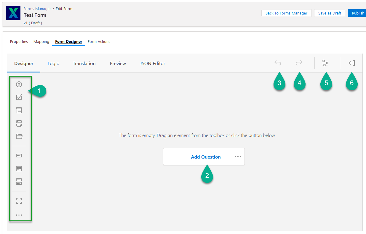
Form Designer Callouts
Callout Description

1

2

Add question - Click to add a question from the among the different types.

3

After elements are on the form, you can undo the last action.

4

After elements are on the form, you can repeat the last action.

5

Open survey settings - Click this menu to change form settings.

6

Show Panel - Click this icon to hide the settings panel.

Form Designer Elements

DG Form Design Elements1

DG Form Design Elements3

DG Form Design Elements3

Radio Button Group

Radio Button

Use this question type for options where the user clicks a radio button for a options defined by the form designer.

Checkboxes

Checkbox

Use this question type for questions where the user can check a box for text-configurable options.

Dropdown

Dropdown

Use this question type for questions with text-configurable dropdown options.

Yes/No (Boolean)

Yes/No

Use this question type for questions with a binary choice, one or the other.

Example 1. Binary choices
  • Yes or No

  • True or False

  • On or Off

  • Open or Closed

  • Enabled or Disabled

File Upload

File Upload

Use this so a user can upload a file stored on the logged in device by dragging into the box or selecting Choose file…​

Single-Line Input

Single Line

Use this so a user can enter a single line of text.

Long Text

Multiple Lines

Use this for a place for the user to enter more than one line of text.

Multiple Textboxes

Multiple Textboxes

Use this so the user can enter text in multiple text boxes.

Panel

Panel

Use this to drag questions and have them set off in a box.

This could be useful if you want to group questions together.

Dynamic Panel

Dynamic Panel

Use this so you can drag questions and have them set off in a box.

You can enter a title for this panel. This could be useful if you want to group questions together.

Single-select Matrix

DG Form Design SingleMatrix

Use this if you have a table that the user needs enter data in the table cells.

Multi-Select Matrix

DG Form Design MultiMatrix

Use this if you have a table and want the user to select from a list of dropdown options that you have defined.

Dynamic Matrix

DG Form Design DynamicMatrix

Use this if you have a table of column where you want the user to choose from a list of dropdown options in each cell.

HTML

DG Form Design HTML

Use this if you want to allow the user to past in an HTML sample.

Expression (Read-Only)

DG Form Design Expression

Use this to show an expression that the user can’t edit.

Signature

DG Form Design Sign

Use this to insert a signature block that the form user can use to capture a signature.

Design a Form

When you design a DataGuide Form, you can add or rearrange an element.

Add an Element

In the DataGuide Form Designer Canvas, you can add questions to the form by clicking on one of the Form Designer Elements or clicking the Add Question box.

Not all the elements are question types. They can be options for a form user to upload a file, capture a signature, enter short, long, or multiple text boxes. You can also define what can be entered in table rows, columns, and table cells.

Add a Multiple-Choice Question

You can add a multiple choice question to the Form Designer canvas. The choice can be:

Table 1. Options for Multiple-choice questions
Radio Button Group Checkboxes Dropdown

Radio Button Group

Checkbox Element

Dropdown Element

The process for adding the question type to the canvas is the same as is the process for adding additional items, deleting unused items, and defining custom text items.

  1. Click either the Radio Button Group element, [Checkboxes element], or the Dropdown element to add the question to the canvas.

  2. Configure the items shown by clicking Item 1 to change the text.

    1. You can delete the item by clicking the red circle.

  3. If you require more items than what is shown, click the blue circle to add another item and change the text label.

  4. Add the None item if no choices are required.

  5. If you need an item for the form user to indicate that all the options can apply:

    1. Click the blue circle next to Other (describe) to add an item with different text.

      Example 2. Use if you want the form user to indicate that all the radio buttons apply

      All of the above.

  6. To duplicate the element, click Duplicate.

  7. To set the element as required, click Required.

  8. To remove the element, click Delete.

Add a Yes/No Question

  1. Click the Yes/No (Boolean) element to add the question to the canvas.

  2. Double-click in the No or Yes text labels if needed.

    Example 3. Binary choices

    You can change the labels to other binary choices such as:

    • True/False

    • On/Off

    • Opened/Closed

    • Enabled/Disabled

Yes/No Element

Add a File Upload Element

Click the File Upload element to add it to the canvas.

File Upload Element

Add a Single-Line Input

  1. Click the Single-Line Input to add this to the canvas.

  2. To duplicate the question, click Duplicate.

  3. To set the question as required, click Required.

  4. To remove the question, click Delete.

Single Line Element

Add a Long Text Input

  1. Click the Long Text to add a form user text long text box to the form.

  2. To duplicate the element, click Duplicate.

  3. To set the element as required, click Required.

  4. To remove the element, click Delete.

Long Text Input Element

Add a Multiple Text Box Element

  1. Click the Multiple Textboxes to add two text boxes to the form.

  2. To duplicate the element, click Duplicate.

  3. To set the element as required, click Required.

  4. To remove the element, click Delete.

Multi-matrix Element on Canvas

Add a Panel

  1. Click the Panel element to add it to the canvas.

  2. Click Add Question to add an element within the panel.

  3. To duplicate the element, click Duplicate.

  4. To set the element as required, click Required.

  5. To remove the element, click Delete.

Panel with questions in it

Add a Dynamic Panel

  1. Click the Dynamic Panel element to add it to the canvas.

  2. Click the panel title to change the text as desired.

  3. Click Add Question to add an element within the panel.

  4. To duplicate the element, click Duplicate.

  5. To set the element as required, click Required.

  6. To remove the element, click Delete.

Dynamic Panel with questions and title

Add a Single-select Matrix

  1. Click the Single-select Matrix to add it to the canvas.

  2. Click the column or row headers to change the text.

  3. To duplicate the element, click Duplicate.

  4. To set the element as required, click Required.

  5. To remove the element, click Delete.

Single select matrix

Add a Multi-Select Matrix

  1. Click the [Multi-select Matrix] element to add it to the canvas.

  2. Click the column or row headers to change the text.

  3. Click the pencil icon in the cell to add items for a dropdown selection.

    Customize list for a cell

    Option list for cell

  4. To duplicate the element, click Duplicate.

  5. To set the element as required, click Required.

  6. To remove the element, click Delete.

Multi-select matrix on canvas

Add a Dynamic Matrix Element

  1. Click the Dynamic Matrix element to add it to the canvas.

  2. Click the column headers to change the text.

  3. Click the pencil icon in the cell to add items for a dropdown selection.

    Customize list for a cell

    Option list for cell

  4. If you need additional rows, click Add Row.

  5. To duplicate the element, click Duplicate.

  6. To set the element as required, click Required.

  7. To remove the element, click Delete.

Dynamic Matrix on Canvas

Add an HTML Block

  1. Click the HTML element to add it to the canvas.

    The form user can paste in HTML code to here.
  2. To duplicate the element, click Duplicate.

  3. To set the element as required, click Required.

  4. To remove the element, click Delete.

HTML Block on Canvas

Add an Expression (Read-Only) Element

  1. Click the [Expresion (Read-Only)] element to add it to the canvas.

    An Expression can’t be made to be Required.
  2. To duplicate the element, click Duplicate.

  3. To remove the element, click Delete.

Expression Block on Canvas

Add a Signature Block

  1. Click the Signature element to add it to the canvas.

    You can have multiple signatures on the form.
  2. To duplicate the element, click Duplicate.

  3. To set the element as required, click Required.

  4. To remove the element, click Delete.

Signature Block on Canvas

Rearrange an Element on the Canvas

  1. Click and hold the Move icon.

  2. Drag the element to its new position on the form.

Edit a Form

You can edit a form that is still in the draft stage. If you want to edit a published form, create a new version of that form, and then publish it.

Once a form is in the draft stage, you can’t change the Object field.
  1. Open the Forms Manager.

  2. Click on the desired form to open it in the Form Designer.

  3. Make the desired changes.