FXL Data Grid
|
To use the FieldFX Lightning package starting with version 1.225, you must use the FieldFX Managed Package version 1.529 or higher. To find the version numbers you have installed, see Check Version Number for FieldFX Managed Package and FieldFX Lightning Managed Package. |
Introduction
FXL Data Grid is a versatile record management tool in FieldFX Back Office when using Lightning Experience.
You can use the FXL Data Grid in much of the same way you use other spreadsheet applications to sort, filter, and edit records.
When parent records are selected, the child records are also selected.
Additionally, with FXL Data Grid, you can:
|
|
Prerequisites
To setup and use FXL Data Grid, you need to:
| Have these user licenses | Have these permissions | Complete these tasks and review these topics before continuing |
|---|---|---|
|
Add Remote Site Settings for Lightning Components
-
Click
 and then Setup.
 -
In Quick Find, start typing
com.-
Choose Company Information.
-
-
Remember the instance name found in the Instance field.
If the instance name is not your customized myDomain field, change it to your myDomain URL. Continue with the next steps. -
Use Quick Find again and start to type
remote.-
Choose Remote Site Settings.
-
-
At the All Remote Sites list, click New Remote Site.
Field Action Remote Site Name
Enter
FX_Lightningas the name of the new site.Remote Site URL
Enter the following URL:
https://mydomain.force.comUse your customized my domain URL that is specific to your org instead of your instance-specific URL. You can find your "my domain" here.
Don’t use instanced URLs when logging in to Salesforce with code or as a user. When your org is moved to another Salesforce instance, code using the instanced URL breaks. If you find instanced URLs in your code, replace them with your My Domain login URL or the default Salesforce login URL. See Log In to Salesforce with Code for more information. Description
Enter an optional description.
-
Click Save.
Column Widths
The minimum column width must be at least 4 px, except for the last column in the grid, where the minimum is 20 px. The initial column width is 210 px.
If the number of columns in the grid doesn’t fill the width of the grid, the column widths are increased to fill the extra space in the grid.
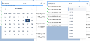
Date/Time Pickers
The date and time pickers have been redesigned and combined into one picker.
| Old | New |
|---|---|
|
|
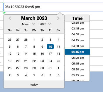
If the time incorrectly displays is prior to daylight savings time, the new date/time picker has corrected the issue. The time appears correctly and if you type on an empty cell, the time defaults to now. In a cell already with a value, the cell opens to that value.
| If you are entering a specific date or time in a cell, you can use Bksp to erase the time and enter a specific time. Before you had to enter the time in 5 minute increments and couldn’t specify an exact time. . Save the changes to the cell by clicking out of it after making changes or pressing Enter. |
New Field Control Behaviors
With recent changes to the FXL Data Grid, control behaviors are now different.
| DateTime | Action | Old Control Behavior | New Control Behavior |
|---|---|---|---|
DateTime |
To open the control, double-click or press Enter |
Display the current date/time based on the user’s local time zone |
Display the current date/time based on the user’s UTC time |
Display Time |
Military Time |
Standard Time |
|
On an empty cell, double-click to open the control and click off without selecting anything |
Don’t set any value |
Set current date/time |
|
Typing values manually |

|
Only allowed to overwrite existing values |
|
You can delete values using Delete/Backspace keys |
Select cell, press Delete/Backspace keys once and click off the cell |
Select cell, press Delete/Backspace keys twice |
|
Date |
On an empty cell, double-click to open the control and click off without selecting anything |
Don’t set any value |
Set current date |
Typing values manually |
|
Only allowed to overwrite the existing value |
|
You can delete values using Delete/Backspace keys |
Select cell, press Delete/Backspace once and click off the cell |
Select cell, press Delete/Backspace twice |
|
Time |
Display Time |
Military Time |
Standard Time |
On an empty cell, double-click to open the control and click off without selecting anything |
Don’t set any value |
Set current time based on the user’s local time zone. |
|
Typing values manually |
|

|
Grid and Edit Mode
When using the FXL Data Grid, the arrow keys (→, ←, ↑ and ↓), Enter, Tab, and Esc keys work differently in Grid Mode and Edit Mode.
| Key | Grid Mode | Edit Mode |
|---|---|---|
→ ← ↑ ↓ |
Navigate to the adjacent cells. |
|
→ ← |
Moves to the adjacent cell |
Moves the cursor left/right to the next character. |
↑ |
Moves the selected cell to the one above. |
Moves the cursor to the beginning of the cell’s text. |
↓ |
Moves the selected cell to the one underneath. |
Moves the cursor to the end of the cell’s text. |
Enter |
Enters into Edit mode. |
Exits out of Edit mode and saves changes. |
Esc |
Exits the Edit mode (and reverts changes). |
|
Tab |
Exits out of Edit mode, saves changes, and moves focus to the cell to the right. |
| A locked cell appears with a blue outline and persists as you scroll side-to-side or up and down in the Data Grid. |
Step-By-Step Guides
When using the FXL Data Grid, you can:
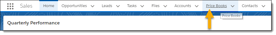
Access the FXL Data Grid
-
Switch to the Lightning Experience.
-
Access the list of records for which the FXL Data Grid is activated.
For example: You want to manage price book item records.
-
From your Home page, click Price Books.
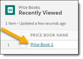
-
Click the price book.
-
Review the records presented by the data grid.
The grid loads 2,000 records at a time.
-
Click the Load More button to display additional roads.

The grid has a limit of 50,000 records.
After 50,000 records, the Load More button is disabled and displays as Row Limit Exceeded.

Set and Use a Data Grid Custom View
| To utilize the custom data grid views, your Lightning Managed Package must be 1.225 or later and you must have FieldFX Managed Package v1.529 installed in your org. |
Custom Views allows a user to set the columns from those made available by the admin and sort options for items in any custom object. Once the custom view is defined, the user can navigate away or even logout, then once they return they can select the custom view like they never left.
-
In the Data Grid, click
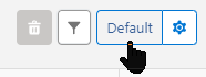 to the right of the filter button.
 -
Click
 to open a modal where the columns can be shown for the custom view.
The columns you can set in the custom view are those set by the admin. Even if no custom views have been set, the button still shows Default. -
Set the specifics for the grid view:
Field Description Active Grid View
Name of the grid view that is shown.
Grid Views
Drop down list of the grid views available, if more than one.
Name
(required)Name of the grid view.
Save As
Saves the grid view options
Delete
trash can iconDeletes the custom grid view.
Save Changes
Allows you to save any changes you have made to the custom view.
Columns
The columns made available by the admin to see in the custom view. You can toggle the view of the column to show or hide the column. With the Hide indicator, the column is grayed out.
Use the arrow buttons to move the column up (to the left) or down (to the right). If the column is at the bottom (farthest to the right), you can’t move it down any more. Similarly with a column at the top (farthest to the left), you can’t move it up any more.
You can see the name of the column and the character width.
-
-
Set the options as described in the table for the custom view.
-
When you finish,
-
Save the view.
-
Click
 to change the grid to the new grid view.
 -
Click
 to return to the data grid.
-
-
Click
to select the custom view. If there is more than one, use the dropdown menu that appears and select the custom view.
Sort Records in the FXL Data Grid
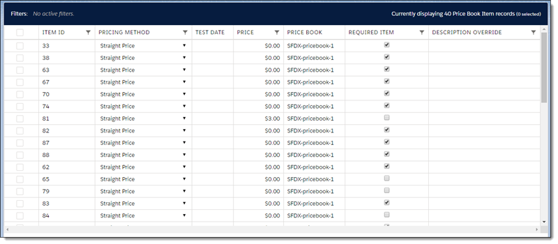
The records in the data grid are sortable, either by a single column or by multiple columns. You might want to sort the price book records in the data grid by Pricing Method.
Sort by a Single Column
-
Click the PRICING METHOD column heading to sort the records in ascending order.
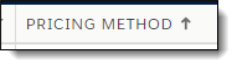
The Ascending arrow icon displays next to the column heading.
-
If you want to sort in descending order instead, click the PRICING METHOD column heading again.
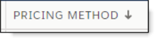
The Descending arrow icon displays next to the column heading.
Sort by Multiple Columns
Use these steps to sort by more than one column. For these steps, records are sorted by Discount Percent, then by Item Code.
-
Click the column headings in the order that you want to sort them.
Not all types of fields can be sorted. For example, multi-select picklist fields, rich text areas, and encrypted fields are not sortable and cannot be selected. The columns that are used for sorting display in a row just above the grid’s heading row.
For example, click the Discount Percent column heading, then click the Item Code column heading.
-
To remove a column sort, click the
Xnext to the column label. -
To change the direction of a column’s sort, click, on the column label.
The arrow on the left of the label indicates whether the sorting is ascending or descending. Example 1. Ticket Items are sorted first by Input Qty (in descending order), then by the Discount Percent (in descending order), then by Item Code (in ascending order).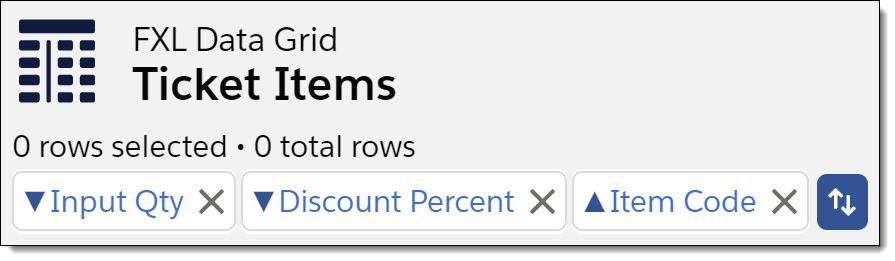
-
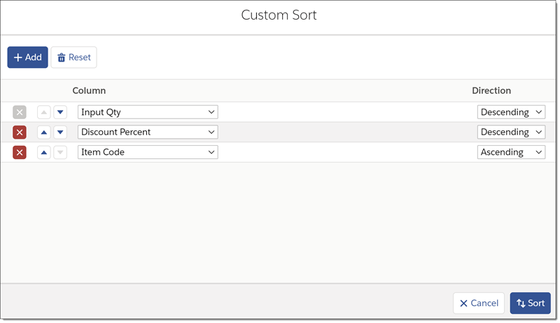
Use the unlabeled custom sorting button to access the Custom Sort screen.

On this screen, you can:
-
Add a Column to sort by
-
Delete a Column sort
-
Change the sort Direction of a Column
-
Reorder the Column sort priority
-
Reset the sorting to the Data Grid’s defined Initial Column Sort
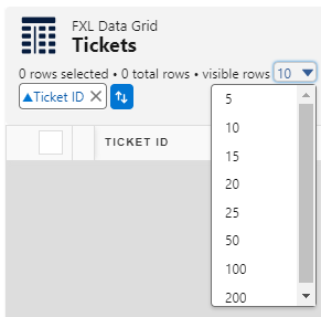
Select the Number of Rows to Display
When viewing items in the Data Grid, you can choose how many rows appear. This applies to Ticket and Invoice Items.
In the FXL Data Grid, use the visible rows dropdown to select the number of rows to show.
|
Only dropdown options up to the maximum number of items in the Data Grid are displayed. Example 2. If Data Grid only has 40 items
You won’t see options past 40.
|
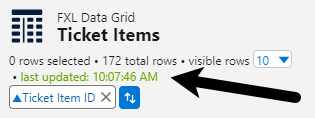
Load More Items in the DataGrid
If there are more items in the Data Grid that can be displayed or you want to see more items, click  .
.
After more rows are loaded, an update message appears with the time of the update:
Select Items in the FXL Data Grid
When items display in the grid, select a particular record by clicking on the blank box in the first column of the record.
A selected item is displayed with a black square in the box. Selecting a parent item also selects all of the child items.
Deselect an item by clicking the box again, clearing the black square. Deselecting a parent item also deselects all of the child items.
Use the square in the header row that displays the titles of columns to select all displayed records or deselect all records. Children of parent items are selected and deselected with the parent item. You can only select or deselect currently displayed records.
If you click to select all items and then click to show additional items, the newly displayed items are not selected. Click the select all square again to select those items as well.
Row totals display at the bottom of the grid: |
|
| You can work with large data sets in FXL Data Grid. Users can now update multiple data rows in quick succession. They won’t have to wait for the grid to refresh. Neither will they encounter row lock errors due to various background processes triggered by the edit. |
The refresh of the Data Grid and the visible fields have been updated.
If there are pending updates, |
If the updated field is the same as the edited field, |
A Updates Pending button appears. Clicking on the button will update the grid but stay in edit mode. The updates are highlighted in green for 10 seconds. If there are updates, those cells are highlighted in blue. |
The user’s edits overwrite the last external edit. When the user finishes their edit session, they can click the Updates Pending button to see all the updates they have just made. |
Filter Records in the FXL Data Grid
You can filter records in the FXL Data Grid and even layer the filters to drill down to the specific data you need.
The user’s Profile or Permission Set must grant access to the View Setup and Configuration System Permission for lookups to function in an FX Lightning component, such as on this page.
|
Example:
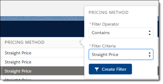
You want to filter the price book records in the data grid by PRICING METHOD. Then you decide you want to add another layer of filtering using PRICE. The filter button in the PRICING METHOD column heading indicates both columns can be filtered.

-
Click the filter button to access the filter window specific to the PRICING METHOD.
-
Select the Filter Operator.
-
Enter the Filter Criteria.
-
Complete any other available or required fields.
-
Click Create Filter.
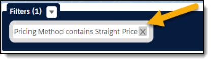 Figure 1. The Filters message confirms the records are sorted by Pricing Method.
 -
Click the filter button to access the filter window specific to PRICE.
-
To add another filter, repeat steps 2–5.
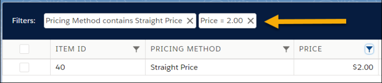 Figure 2. The Filters messages confirm the records are sorted by Pricing Method and, in a second layer of filtering, by Price.
Navigate using Keyboard Shortcuts
To navigate the FXL Data Grid, use these keyboard shortcuts for inline navigation.
| Keyboard Shortcut | Action |
|---|---|
Tab |
Move right to the next cell in a row or to the first cell in the next row. |
→ |
|
Shift+Tab |
Move left to the next cell in a row or to the last cell in the previous row. |
← |
|
↑ |
Move up to the previous cell in a column or in a drop-down selection menu for a cell. |
↓ |
Move down to the next cell in a column or in a drop-down selection menu for a cell. |
Enter |
Access a cell editor or exit the cell editor. |
Alt+Shift+C |
Discard changes in the record before you have saved them. |
Alt+Shift+S |
Save changes to a record. |
Edit an FXL Data Grid Cell
You can update an editable (non-gray) cell within the FXL Data Grid. Cells that are gray are locked. The FXL Data Grid supports editing rich text fields.
There are multiple ways for you to access a cell to make edits.
-
Double-click the cell with your mouse.
-
Select the cell with your mouse and either begin typing or press Enter.
-
Navigate to the cell using keyboard shortcuts and begin typing or press Enter.
To update an editable cell in the FXL Data Grid, follow these steps:
-
Access the cell.
-
Edit the contents of the cell.
| If you are entering a specific date or time in a cell, you can use Bksp to erase the time and enter a specific time. Before you had to enter the time in 5 minute increments and couldn’t specify an exact time. . Save the changes to the cell by clicking out of it after making changes or pressing Enter. |
|
The FXL Data Grid now shows a message next to the action buttons:
|
-
The cell shows the new value.
Update a FXL Data Grid Record
-
Edit the applicable cell(s) in the record.
-
When you are finished editing, click Save Changes to commit all your active edits to records.
If you click Discard Changes, you will lose all uncommitted edits.
Reorder Items in the FXL Data Grid
You can reorder line items in the FXL Data Grid either by:
Drag Item to Reorder
-
To move an item in the FXL Data Grid, click and hold on the item’s
 icon.
icon. -
Move the item to the new position.
-
Drop the moved item on top of another item in the bundle
The moved item appears above the item you were hovering over.
-
Only items within the same bundle can be moved to a new position. You can’t move items from one bundle to another bundle.
-
If the dragged item is a parent item, the child items are reordered.
-
Reset Value to Reorder
You can reorder the items by changing the value in the entry field in the SEQUENCE NUMBER column.

|
Dependent Fields
When a field with a dependency on another field is added to the grid, the column heading displays an icon for more information. Hovering the mouse over the icon shows a tooltip that identifies the controlling field.
| The Controlling Field doesn’t have to display on the Data Grid with the dependency. However, the values for the dependent field still rely on the entry in the controlling field. |
| Controlling fields are defined by creating Field Dependencies in the object record in Setup. They are often used for defining picklist fields. |
Locked Fields
Price Book Item, Quote Item, and Ticket Item fields can be locked by a matching controlling field prefixed with Locked_.
FieldFX provides default locking fields for Description, Discount Percent, and Price Markup fields.
In addition, admins can also add custom locking fields. When the locking field is true, the locked field cannot be edited or bulk edited.